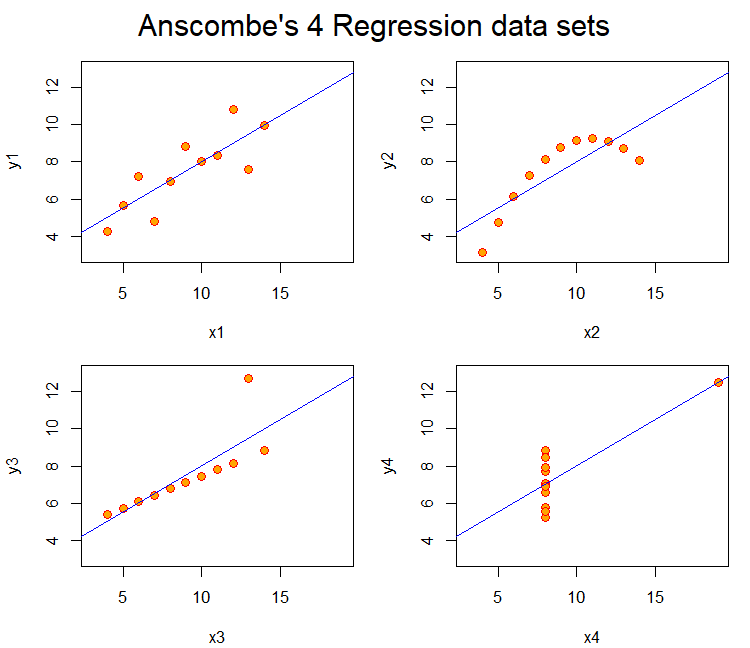
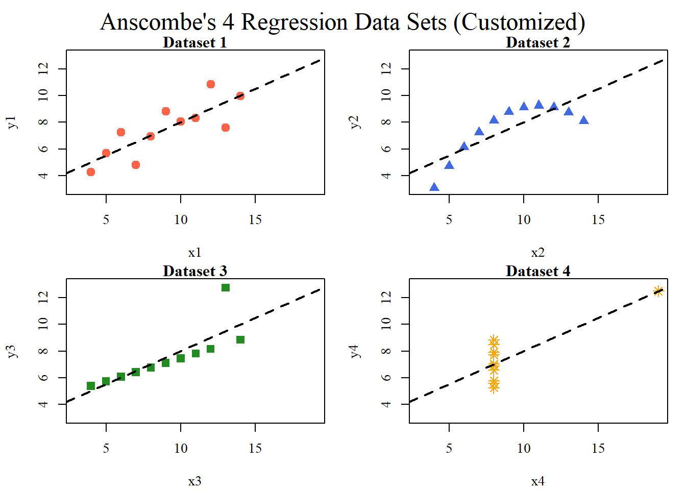
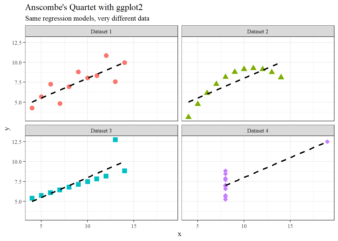
Anscombe’s (1973) paper highlights how datasets with nearly identical summary statistics (mean, variance, correlation, regression line) can nonetheless reveal strikingly different patterns when graphed. The four models demonstrate reliance on numerical measures alone can obscure key features such as non-linearity, outliers, and unusual data structures. The main lesson is the essential role of visualization in statistical analysis. Visualization of the models or data can improve quantitative summaries. A practical solution is to incorporate exploratory data analysis (EDA) techniques, such as scatterplots, boxplots, and residual plots, early in research to detect anomalies before modeling. Additionally, modern extensions like interactive visualizations and diagnostic checks can further safeguard against misleading interpretations, ensuring that conclusions rest on both robust statistics and an accurate understanding of the underlying data.
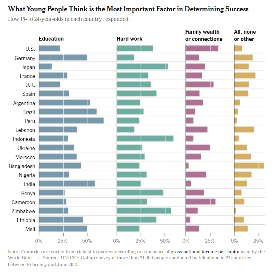
This chart from a UNICEF–Gallup survey shows what young people (ages 15–24) in 21 countries believe is the most important factor in determining success. The side-by-side horizontal bar charts are helpful for seeing within-country differences, but the design makes cross-country comparisons harder than necessary. Because the categories are split into four separate panels, the viewer has to scan back and forth across columns rather than directly comparing values on a single axis. The sorting of countries by income per capita adds context, but introduces a visual bias. Readers may infer causal relationships between national wealth and values without the chart explicitly addressing them. A clearer alternative would be to combine responses into a grouped or stacked bar chart, aligning all categories for each country in one view. Small multiples with consistent scales would make it easier to compare how emphasis on education, hard work, or family wealth varies across regions. Simplifying the layout would improve readability and strengthen the chart’s ability to communicate cultural differences in beliefs about success.
Assignment 2
Paul Murrell’s RGraphics basic R programs using Happy Planet Index Data set (2024)
library(readxl)library(dplyr)
Attaching package: 'dplyr'
The following objects are masked from 'package:stats':

    filter, lag
The following objects are masked from 'package:base':

    intersect, setdiff, setequal, union
hpi =read_excel("hpi_2024_public_dataset.xlsx", sheet ="1. All countries", skip =7)
New names:
• `` -> `...4`
head(hpi)
# A tibble: 6 × 12
  `HPI rank` Country     ISO   ...4    Continent `Population (thousands)`
       <dbl> <chr>       <chr> <chr>       <dbl>                    <dbl>
1         NA Burundi     BDI   2021BDI         5                   12551.
2         NA Sudan       SDN   2021SDN         5                   45657.
3          1 Vanuatu     VUT   2021VUT         8                     319.
4          2 Sweden      SWE   2021SWE         3                   10467.
5          3 El Salvador SLV   2021SLV         1                    6314.
6          4 Costa Rica  CRI   2021CRI         1                    5154.
# ℹ 6 more variables: `Life Expectancy (years)` <dbl>,
#   `Ladder of life (Wellbeing) (0-10)` <dbl>,
#   `Carbon Footprint (tCO2e)` <dbl>, HPI <dbl>,
#   `CO2 threshold for year  (tCO2e)` <dbl>, `GDP per capita ($)` <dbl>
colnames(hpi)
 [1] "HPI rank"                          "Country"
 [3] "ISO"                               "...4"
 [5] "Continent"                         "Population (thousands)"
 [7] "Life Expectancy (years)"           "Ladder of life (Wellbeing) (0-10)"
 [9] "Carbon Footprint (tCO2e)"          "HPI"
[11] "CO2 threshold for year  (tCO2e)"   "GDP per capita ($)"
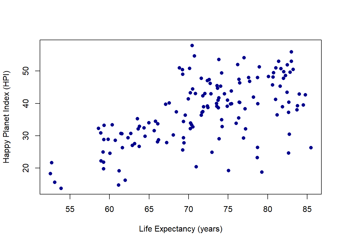
plot(hpi$"Life Expectancy (years)", hpi$HPI, pch =16, col ="darkblue",xlab ="Life Expectancy (years)",ylab ="Happy Planet Index (HPI)")
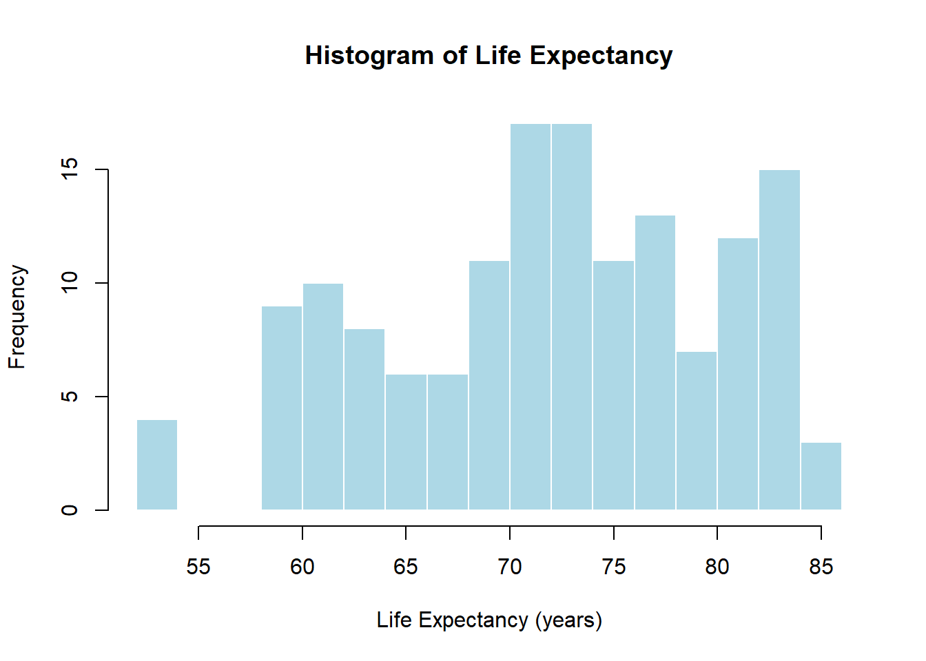
hist(hpi$"Life Expectancy (years)", breaks =20, col ="lightblue",border ="white",main ="Histogram of Life Expectancy",xlab ="Life Expectancy (years)")
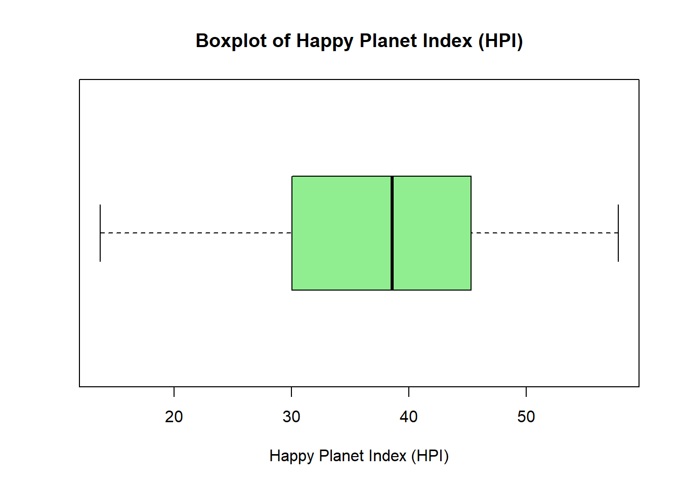
boxplot(hpi$HPI, horizontal =TRUE, col ="lightgreen",main ="Boxplot of Happy Planet Index (HPI)",xlab ="Happy Planet Index (HPI)")
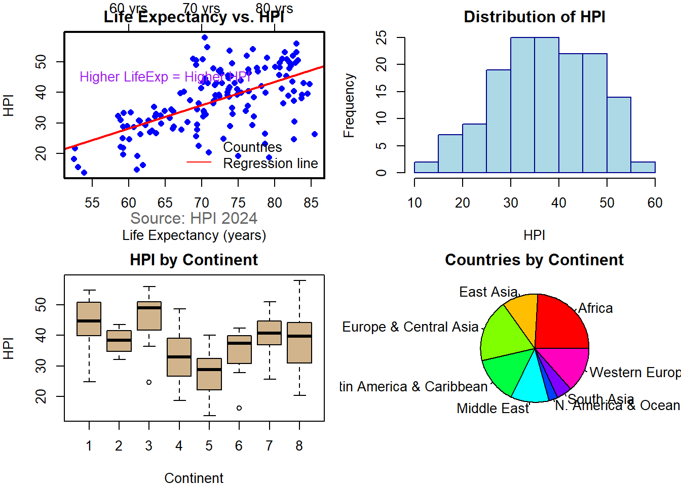
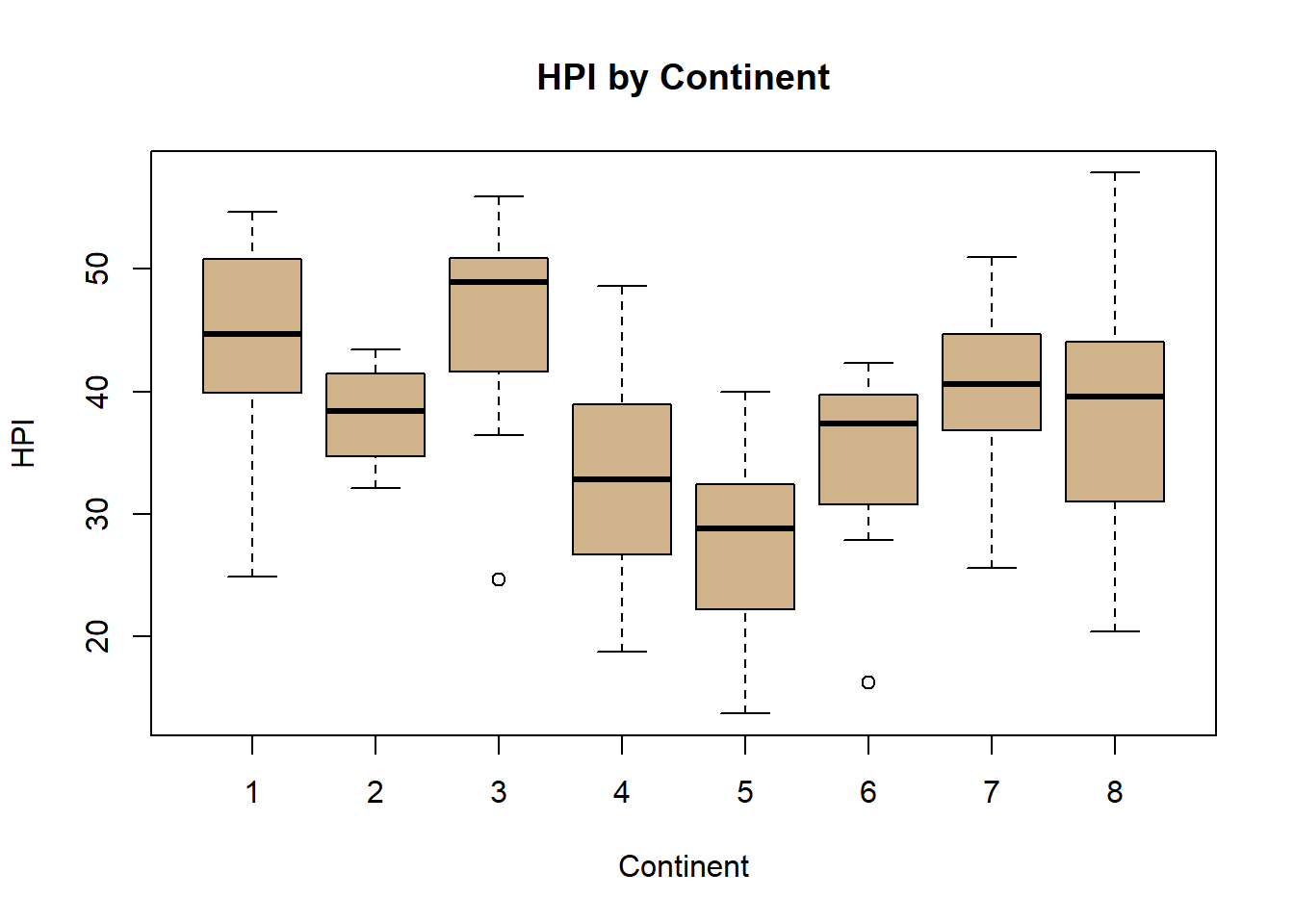
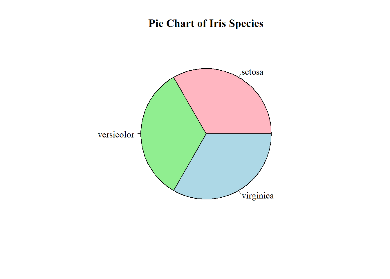
hpi <- hpi %>%rename(LifeExp =`Life Expectancy (years)`)# ---- 1. Scatter with par(), points(), lines(), axis(), box(), text(), mtext(), legend() ----par(mfrow =c(2, 2), mar =c(4, 4, 2, 1)) # grid layoutplot(hpi$LifeExp, hpi$HPI,xlab ="Life Expectancy (years)", ylab ="HPI",main ="Life Expectancy vs. HPI", col ="blue", pch =16)abline(lm(HPI ~ LifeExp, data = hpi), col ="red", lwd =2)# Add top axisaxis(3, at =seq(40, 85, 10), labels =paste0(seq(40, 85, 10), " yrs"))# Add box around plotbox(lwd =2)# Add annotationtext(65, 45, "Higher LifeExp = Higher HPI", col ="purple")# Add margin textmtext("Source: HPI 2024", side =1, line =2, col ="gray40")# Add legendlegend("bottomright", legend =c("Countries", "Regression line"),col =c("blue", "red"), pch =c(16, NA), lty =c(NA, 1), bty ="n")# ---- 2. Histogram ----hist(hpi$HPI, col ="lightblue", border ="darkblue",main ="Distribution of HPI", xlab ="HPI")# ---- 3. Boxplot ----boxplot(HPI ~ Continent, data = hpi,col ="tan", main ="HPI by Continent",xlab ="Continent", ylab ="HPI")# ---- 4. Pie chart + names() ----continent_labels <-c("1"="Latin America & Caribbean","2"="N. America & Oceania","3"="Western Europe","4"="Middle East","5"="Africa","6"="South Asia","7"="Eastern Europe & Central Asia","8"="East Asia")# Replace numeric codes with nameshpi$Continent <-as.character(hpi$Continent)hpi$Continent <- continent_labels[hpi$Continent]#hpi$Continent <- as.character(hpi$Continent)#hpi$Continent <- ifelse(hpi$Continent %in% names(continent_labels),#continent_labels[hpi$Continent],#"Unknown")continent_counts <-table(hpi$Continent)pie(continent_counts,col =rainbow(length(continent_counts)),main ="Countries by Continent")
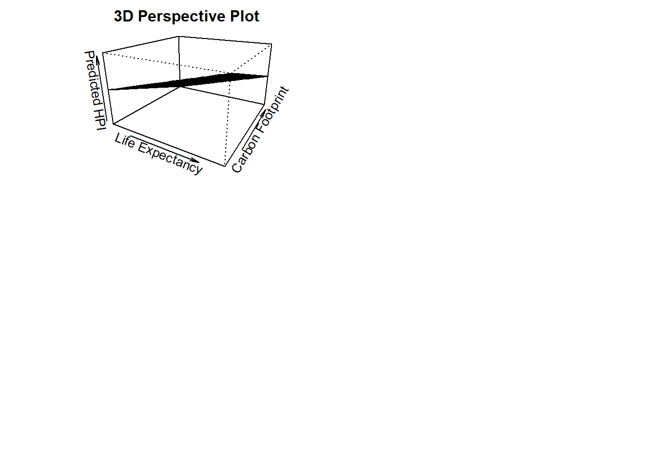
# ---- 5. Perspective plot ----# Create grid for LifeExp vs. Carbon → predict HPI# Remove non-numeric characters and converthpi$Carbon <-as.numeric(hpi$`Carbon Footprint (tCO2e)`)# Confirm it workedsummary(hpi$Carbon)
   Min. 1st Qu.  Median    Mean 3rd Qu.    Max.
  0.201   2.182   5.488   7.305  10.107  42.201
library(readxl)hpi =read_excel("hpi_2024_public_dataset.xlsx", sheet ="1. All countries", skip =7)
New names:
• `` -> `...4`
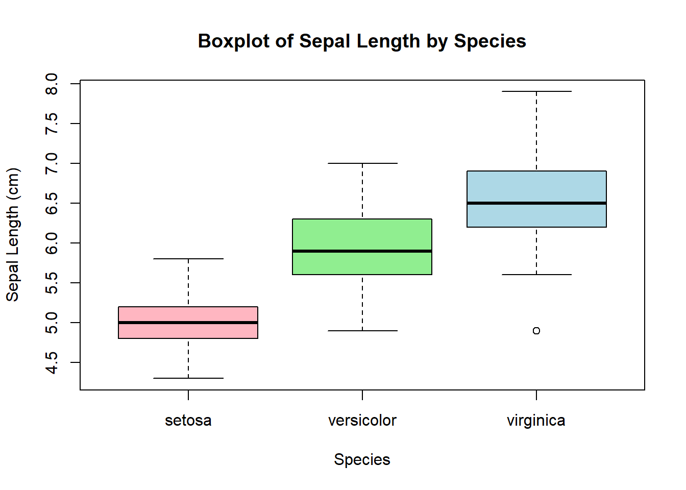
boxplot(HPI ~ Continent, data = hpi, col ="tan", main ="HPI by Continent", xlab ="Continent", ylab ="HPI")
Assignment 3
# Barplot Murrell's graphicspar(mar=c(2, 3.1, 2, 2.1)) #adjusts plot margins. bottom=2, left=3.1, top=2, right=2.1midpts <-barplot(VADeaths, col=gray(0.1+seq(1, 9, 2)/11), names=rep("", 4)) #col sets a gray scale to the points#mtext adds text to the margins of the plot. adds custom x-axis labels beneath bars# side=1 draw at the bottom of the plot ,line=0.5 moves labels closer to the bars# cex=0.5 makes the font smallermtext(sub(" ", "\n", colnames(VADeaths)),at=midpts, side=1, line=0.5, cex=0.5)#rep adds a bar at each midpoint for each group, adding cumulative sums of the deathstext(rep(midpts, each=5), apply(VADeaths, 2, cumsum) - VADeaths/2, VADeaths, col=rep(c("white", "black"), times=3:2), cex=0.8) #shrinks text slightly
# Reset margins back to defaultpar(mar=c(5.1, 4.1, 4.1, 2.1)) # Anscombe Visulization with RGraphicsdata(anscombe) # Load Anscombe's dataView(anscombe)op <-par(mfrow =c(2, 2), mar =0.1+c(4,4,1,1), oma =c(0, 0, 2, 0), family="serif")ff <- y ~ xmods <-setNames(as.list(1:4), paste0("lm", 1:4))# Define colors and point characterscols <-c("tomato", "royalblue", "forestgreen", "orange")pch_vals <-c(19, 17, 15, 8) # Loop over 4 datasetsfor(i in1:4) { ff[2:3] <-lapply(paste0(c("y","x"), i), as.name) mods[[i]] <- lmi <-lm(ff, data = anscombe)plot(ff, data = anscombe,col = cols[i], pch = pch_vals[i], cex =1.3,xlim =c(3, 19), ylim =c(3, 13),main =paste("Dataset", i))abline(lmi, col ="black", lty =2, lwd =2)}mtext("Anscombe's 4 Regression Data Sets (Customized)", outer =TRUE, cex =1.5)
par(op)#Anscombe Visualization with ggplot2library(tidyverse)
Warning: package 'ggplot2' was built under R version 4.5.2
Warning: package 'readr' was built under R version 4.5.2
Warning: package 'purrr' was built under R version 4.5.2
Warning: package 'stringr' was built under R version 4.5.2
── Attaching core tidyverse packages ──────────────────────── tidyverse 2.0.0 ──
✔ forcats   1.0.1     ✔ readr     2.1.6
✔ ggplot2   4.0.1     ✔ stringr   1.6.0
✔ lubridate 1.9.4     ✔ tibble    3.3.0
✔ purrr     1.2.0     ✔ tidyr     1.3.1
── Conflicts ────────────────────────────────────────── tidyverse_conflicts() ──
✖ dplyr::filter() masks stats::filter()
✖ dplyr::lag()    masks stats::lag()
ℹ Use the conflicted package (<http://conflicted.r-lib.org/>) to force all conflicts to become errors
data(anscombe) # Load Anscombe's dataanscombe_long <- anscombe %>%pivot_longer(cols =everything(),names_to =c(".value", "set"),names_pattern ="(.)(.)" ) %>%mutate(set =factor(set, labels =paste("Dataset", 1:4)))View(anscombe_long)ggplot(anscombe_long, aes(x = x, y = y)) +geom_point(aes(color = set, shape = set), size =3) +# different colors + shapesgeom_smooth(method ="lm", se =FALSE, color ="black", linetype ="dashed") +# regression linefacet_wrap(~ set) +# one plot per datasettheme_bw(base_family ="serif") +# serif fontlabs(title ="Anscombe's Quartet with ggplot2",subtitle ="Same regression models, very different data") +theme(legend.position ="none") +scale_shape_manual(values =c(16, 17, 15, 18)) # dataset1=circle, dataset2=triangle, dataset3=square, dataset4=solid diamond
`geom_smooth()` using formula = 'y ~ x'
Assignment 4 (Hackathon)
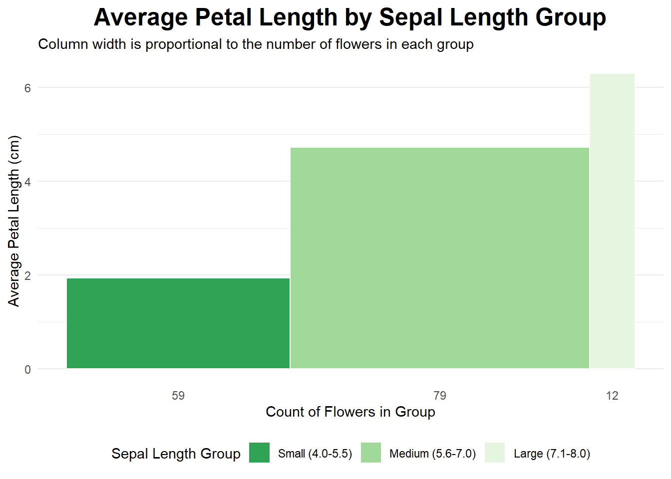
data(iris)library(tidyverse)# 1. Divide the dataset into three rectangles based on species.# The average of Petal.Length and Petal.Width is the length and width.# Draw three rectangles arranged horizontally.#1plot_data <- iris %>%mutate(sepal_length_group =cut( Sepal.Length,breaks =c(4, 5.5, 7.0, 8.0),labels =c("Small (4.0-5.5)", "Medium (5.6-7.0)", "Large (7.1-8.0)"),include.lowest =TRUE ) ) %>%group_by(sepal_length_group) %>%summarise(count =n(),avg_petal_length =mean(Petal.Length) ) %>%mutate(xmax =cumsum(count),xmin = xmax - count,x_label_pos = (xmin + xmax) /2 )ggplot(plot_data, aes(ymin =0)) +geom_rect(aes(xmin = xmin,xmax = xmax,ymax = avg_petal_length,fill = sepal_length_group ),color ="white" ) +scale_x_continuous(breaks = plot_data$x_label_pos,labels = plot_data$count ) +scale_fill_brewer(palette ="viridis", direction =-1) +labs(title ="Average Petal Length by Sepal Length Group",subtitle ="Column width is proportional to the number of flowers in each group",x ="Count of Flowers in Group",y ="Average Petal Length (cm)",fill ="Sepal Length Group" ) +# Apply a clean themetheme_minimal() +theme(plot.title =element_text(hjust =0.5, face ="bold", size =18),legend.position ="bottom",panel.grid.major.x =element_blank(), # Remove vertical grid linespanel.grid.minor.x =element_blank() )
Warning: Unknown palette: "viridis"
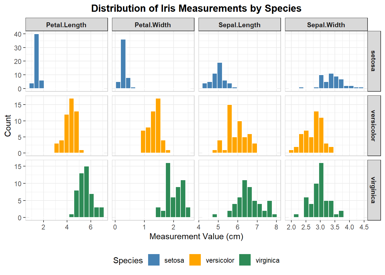
# 2. table with embedded chartsiris_long <- iris %>%pivot_longer(cols =-Species, names_to ="Measurement", values_to ="Value")ggplot(iris_long, aes(x = Value, fill = Species)) +geom_histogram(color ="white", bins =15) +facet_grid(Species ~ Measurement, scales ="free") +scale_fill_manual( #coloring each speciesvalues =c("setosa"="steelblue", "versicolor"="orange", "virginica"="seagreen" ) ) +#labelslabs(title ="Distribution of Iris Measurements by Species",x ="Measurement Value (cm)",y ="Count" ) +theme_bw() +theme(plot.title =element_text(hjust =0.5, face ="bold"),strip.text.x =element_text(face ="bold"),strip.text.y =element_text(face ="bold"),panel.border =element_rect(color ="grey80", fill =NA),legend.position ="bottom" )
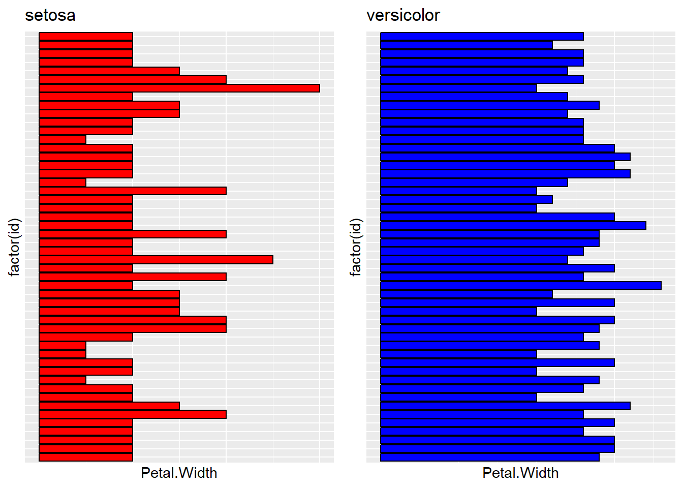
# 3. Extract setona and versicolor from species.# Then create df_2 and df_3. Draw a bar plot using petal.width: p1 p2.# Finally, use gridExtra to combine the plots.'library("gridExtra")
Attaching package: 'gridExtra'
The following object is masked from 'package:dplyr':

    combine
df_2 <-subset(iris, Species %in%"setosa")df_3 <-subset(iris, Species %in%"versicolor")df_2$id <-1:nrow(df_2)df_3$id <-1:nrow(df_3)p1 =ggplot(df_2, aes(x =factor(id), y = Petal.Width)) +geom_bar(stat ="identity", fill ='red', color ="black") +coord_flip() +labs(title ="setosa") +theme(axis.text.y =element_blank(),axis.ticks.y =element_blank(),axis.text.x =element_blank(),axis.ticks.x =element_blank() #this was by GPT )p2 =ggplot(df_3, aes(x =factor(id), y = Petal.Width)) +geom_bar(stat ="identity", fill ="blue", color ="black") +coord_flip() +labs(title ="versicolor")+theme(axis.text.y =element_blank(),axis.ticks.y =element_blank(),axis.text.x =element_blank(),axis.ticks.x =element_blank() #this was by GPT )gridExtra::grid.arrange(p1, p2, ncol =2)
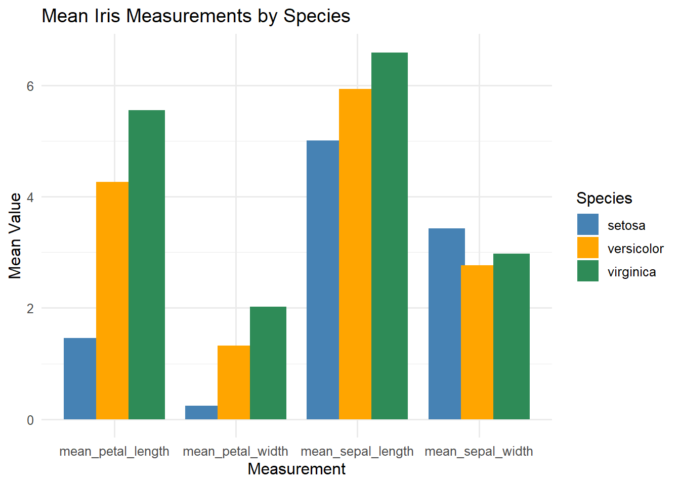
# 4 Column Chart# getting means of Petal length and width for each species# and mean sepal length and sepal widthiris_means <- iris %>%group_by(Species) %>%summarise(mean_sepal_length =mean(Sepal.Length),mean_sepal_width =mean(Sepal.Width),mean_petal_length =mean(Petal.Length),mean_petal_width =mean(Petal.Width) ) %>%pivot_longer(cols =-Species,names_to ="Measurement",values_to ="MeanValue" )ggplot(iris_means, aes(x = Measurement, y = MeanValue, fill = Species)) +geom_col(position =position_dodge(width =0.8)) +labs(title ="Mean Iris Measurements by Species",x ="Measurement", y ="Mean Value") +theme_minimal(base_size =12) +scale_fill_manual(values =c("steelblue", "orange", "seagreen"))
Class coding competition
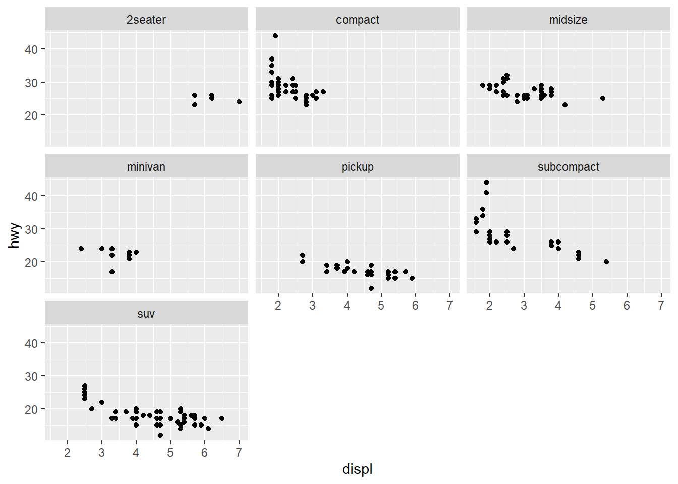
library(ggplot2)mpg <-as.data.frame(mpg)#2seater, compact, midsize, minivan, pickup, subcompact, suv scatterplots in one viewggplot(mpg, aes(x=displ, y=hwy)) +geom_point(color ="black") +facet_wrap(~ class) +labs(x="displ",y="hwy") +theme_gray()
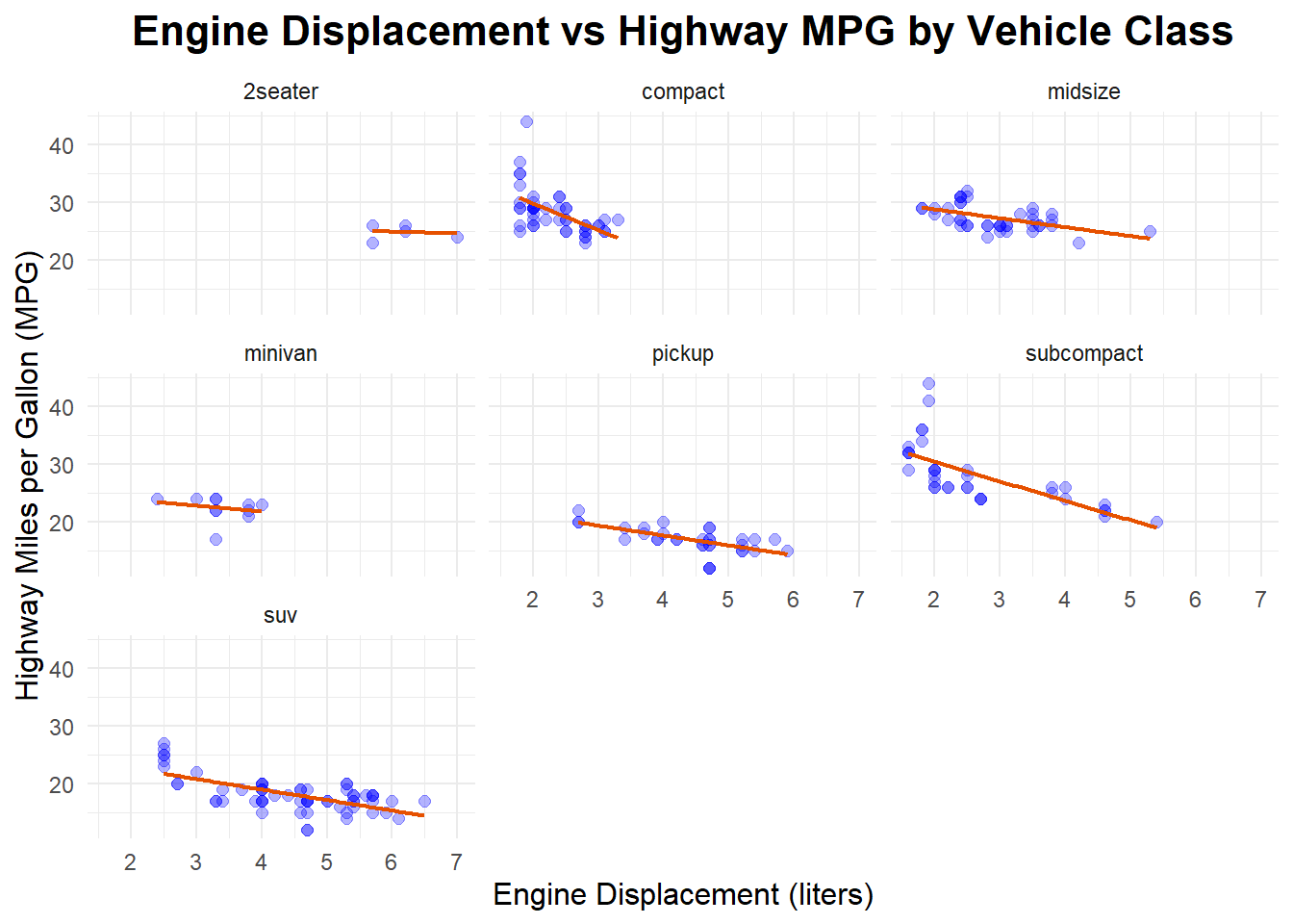
#improving the chartggplot(mpg, aes(x=displ, y=hwy)) +geom_point(color ="blue", size=2, alpha=0.3) +geom_smooth(method ="lm", se =FALSE, color ="#E65100", linewidth =0.8) +facet_wrap(~ class) +labs(title="Engine Displacement vs Highway MPG by Vehicle Class",x="Engine Displacement (liters)",y="Highway Miles per Gallon (MPG)") +theme_minimal() +theme(plot.title =element_text(hjust =0.5, size=16, face="bold"),axis.title.x =element_text(size=12),axis.title.y =element_text(size=12) )